Lasha Tavberidze Headshot

Lasha Tavberidze

UX Designer

Great design is invisible—it just works. I’m Lasha, a Los Angeles-based UX Designer obsessed with removing friction across any touchpoint. I leverage a background of rapid problem-solving in high-pressure environments to anticipate human needs before they become pain points. I don’t just build interfaces; I design intuitive, end-to-end systems that empower people and drive lasting adoption.

Hollow Frequency

Mobile Merch App — Streamlining limited-edition drops for industrial metal fans.

Role

Lead UX/UI Designer

Timeline

Jan – Feb 2026

Tools

Figma, Google Workspace suite, FigJam

Deliverables

Research, Wireframes, Usability Studies, Hi-Fi Prototype

1

The Challenge

Fans abandon limited-edition merch drops due to slow multi-step checkouts, confusing sizing, and hidden shipping costs.

2

The Solution

A streamlined mobile app featuring a “Quick Buy” one-tap purchase flow, an interactive “FIND MY FIT” sizing tool, and transparent upfront shipping.

3

The Impact

Reduced checkout steps by 30% and enabled purchases in under two minutes.

The Problem & Ideation

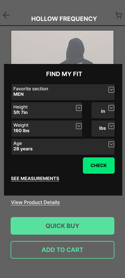
Fans of Hollow Frequency frequently abandon limited-edition merchandise drops due to a punishing checkout experience. The core friction points: a slow, multi-step checkout that bleeds time during high-demand drops, sizing anxiety caused by vague size charts on final-sale items, and hidden shipping costs triggering abandonment right at the finish line. I began my process with rapid paper sketching to quickly visualize solutions without getting bogged down in digital tools.

Ideation Sketches

Research & Structural Foundation

I conducted foundational research through user interviews and a competitive audit. The key finding: none of the competitors offered a “Guest Quick-Buy” feature to capture impulsive sales, and none provided a personalized sizing calculator. Translating these findings into Lo-Fi wireframes allowed me to structure the layout specifically around these new features, prioritizing speed over visual fluff before testing with real users.

Lo-Fi Structure (3)

The Solution: "Quick Buy"

To eliminate the multi-step checkout problem, I designed a “Quick Buy” button directly on the home feed. This lets returning fans bypass the catalog and jump straight to checkout in three taps. Applying the 60-30-10 color rule, I used the vibrant accent color specifically for primary CTA buttons to ensure they stood out against the dark, industrial-themed background.

Hi-Fi Flow (2)

The Solution: "FIND MY FIT"

To cure the sizing anxiety that was causing cart abandonment, I implemented an interactive “FIND MY FIT” modal placed directly next to the size selector. By allowing users to quickly input their dimensions rather than squinting at a PDF chart, users felt 100% confident checking out with final-sale items.

Product & Sizing (2)

UX Takeaway

“Functionality and speed must prioritize over pure aesthetics. Beautiful UI only matters if the UX actually gets the user through the checkout line.”

End-to-End UX & Systems Strategy

Grounded by the Google UX Design Professional Certificate in core research and prototyping, I expanded my toolkit with specialized IxDF certifications in Service Design, UX Management, and User Adoption. Together, this empowers me to orchestrate seamless experiences across any environment, driving both immediate usability and long-term user habituation.